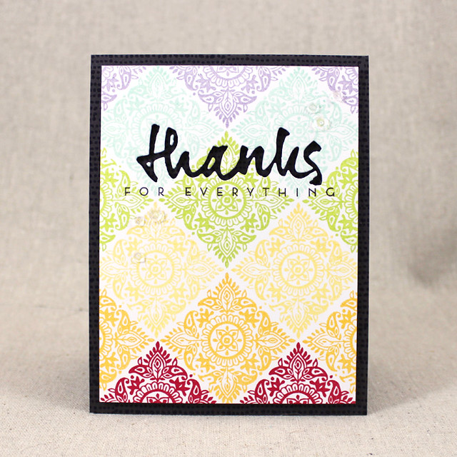
While the fabulous DT for Papertrey Ink showcases this month's new products, we get to play along using their projects as inspiration with links
here on Nichole's blog. They come up with so many awesome creations that it's challenging to narrow down which ones to use. This is a great opportunity to challenge myself outside of my comfort zone and attempt something different. I've created two cards (but only one entry) as I was on a roll yesterday and actually finished five cards. This first card is a bit of a mix from
Lizzie's Woodblock Prints (3rd one) beautiful rainbow card on the left and a spin off of
Kay's Woodblock Prints (1st one) on the rightwith the bolder colors and white, layered die-cuts.


Rarely do I take on the task of creating a background that needs to be more precise than random flowers and/or leaves, but this was a fun challenge for me. Thanks to my MISTI and Lovely Layers stamp set I was able to line it up pretty well. Even though I didn't use the exact same colors as Kay's lovely card above, I only substituted Royal Velvet for Simply Chartreuse as I thought it would be too much green for my design. If you look closely or enlarge this image, you can see I stamped "Big Hugs" in Royal Velvet beneath my three-layered, white "sending" die cut. Coordinating colored sequins finished it off after adhering it to a Summer Sunrise card base and rounding the two bottom corners.
Supplies: (all PTI unless noted)
Cardstock: Stamper's Select White and Summer Sunrise
Ink: Oranze Zest, New Leaf, Summer Sunrise, Tropical Teal, Royal Velvet and Raspberry Fizz
Stamps: Wet Paint Cuts III
Dies: Wet Paint Cuts III
Other: Corner Rounder, Sequins and SU Dimensionals
* * * * *
Here's my inspiration from
Danielle's blog (also her 3rd card):
Thought it would be fun to try stenciling using two different colors separating a design. Since my stencil supply is limited to Modern Backgrounds and Color Pops Florals, I decided to create an oval mask for the center. The inks I blended are Mint Julep and Ocean Tides. I really like the combination but when it came time to choose the mat color, the Mint Julep ink coordinated better with Simply Chartreuse card stock. It really was a long shot against the Mint Julep card stock, at least in my opinion. Here's my take:
Thanks for stopping by, and I truly do appreciate your comments!
Supplies: (all PTI unless noted)
Cardstock: Stamper's Select White and Simply Chartreuse
Ink: Mint Julep, Ocean Tides and Pinefeather
Stamps: Graceful Greetings
Dies: None
Other: Modern Background Stencils, Oval Mask, Ink Blending Tool and SU Dimensionals


